Charcoal and peppers, September 2014
|
3' X 2'
coffee and charcoal Our art studio class was privileged to paint with the amazing Tadashi. We randomly put coffee over the canvas, then we were given a flower or a pepper, with which to work. This project really helped open me up as an artist. I was able to get over my hesitation with going darker and fear of making mistakes. Tadashi taught us how to follow your intuition. This ended up being a really strong piece; I loved being able to work with the coffee and find shapes outside of the peppers. I was really able to put myself into it and listen to the piece. |

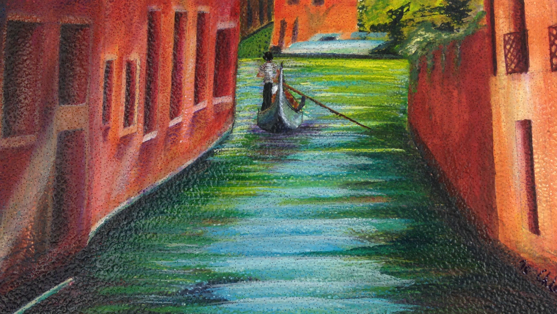
Venice, October 2014
|
32" X 21"
acrylic on cardboard This was my favorite project to do. I love Venice, Italy; I was so excited that I would be able to incorporate it into one of my projects. Doing this painting on cardboard, instead of on just a plain canvas, really helped to keep me open-minded. I had so much fun working with all of the colors in the buildings and in the water. |

A green apple, September 2014
|
22" X 15"
charcoal, gouache, and prisma colored pencil This was the first project we did in my AP art studio class. I often use charcoal so I loved being able to work with what I know. I also enjoyed being able to test out some new media on the apple using prisma and gouache. I really enjoyed being able to work with shadow and to practice keeping my art from floating. |

Mondrian Flower, July 2014
|
12" X 12"
acrylic and water color I had a great deal of fun working on this. I researched some art styles/artists over the summer, for my AP class; this piece was based off Mondrian art. So I started with putting together my shapes for the background; that itself was a lot of fun, but It just didn't feel complete. I then looked up blue images that would work with the back-round; I was intrigued with the idea of using water color over the acrylic, to add layers. Lastly, it just needed something else to pull it together and the watered down acrylic splatter did that perfectly. Sold. |

Aztecan goddess, October 2014
|
20" X 16"
acrylic and charcoal This piece was made to represent dia de los muertos, (the day of the dead, a Mexican Holiday). I wanted to approach this accurately, and going back to the roots of the holiday was the best way I knew how to do that. Dia de los muertos was originally a Aztecan tradition. This statue is supposed to be Mictlan- Aztecan goddess/ Queen of the underworld- who watched over the bones of the dead and presided over the festivals of the dead- known today as day of the dead. |

Still life, November 2013
|
11" X 8"
graphite and prisma colored pencil This is not an original piece, but it is based off one of Stephan Sprees still life, combined with my own imagery- the nail polish. In this picture a flower is in front of two mugs- one inside of the other, and there is a cloth napkin laying next to the flower. Value was the project focus. |

Silly face, April 2014
|
17" X 12"
graphite This was a self portrait. We took pictures of silly-abnormal faces, printed them, and drew them. It was a lot of fun to work with myself as the subject matter. After this piece I realized that I was pretty fond of faces. |

Puzzle pieces, January 2014
|
14" X 14"
colored pencil and graphite This was a puzzle piece assignment. It helped me open up to multimedia and with combining different ideas into one picture. |

Baby Reid, August 2014
|
11" X 8"
charcoal This is a portrait of my friends baby, Reid. I went to Canada on a missions trip, in the summer of 2014. While I was there, I absolutely fell in love with the kids! It was so amazing to share Jesus with them! One of the girls, Cindy, kept posting pictures of her baby on Facebook. And he's such a beautiful baby that I couldn't help but look through her Facebook and find a good picture of Reid to draw. :) |
Ben, November 2014
|
8" X 10"
ink resist with wax This was a partner project. Each person did contours of their partner and transferred the image onto watercolor paper. We added tempera paint and wax onto the image, before adding ink over the picture. Then we rinsed and scrubbed the paper with water and the paint and wax acted as manipulators so that those areas do not stay black. |
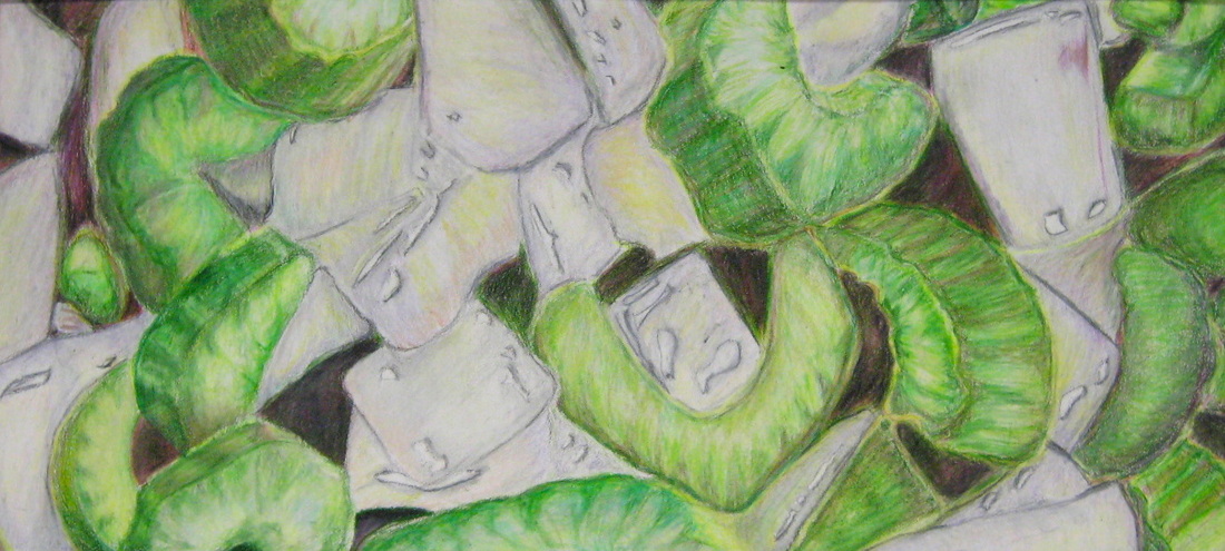
Celery and onion, December 2014
|
13" X 6"
colored pencil This was the project that my class did for Thanksgiving. We had to take pictures of food from a unique perspective. I took my picture of celery and onion- the beginnings of stuffing. I loved this piece; I was really able to rely on my intuition and make the colors my own, since it is difficult to capture the natural colors of celery and onion, using bright prisma pencils. I liked how it is fun with the bright and eccentric colors, but it's still just celery and onion. |

Moose, August 2014
|
11" X 8"
charcoal |

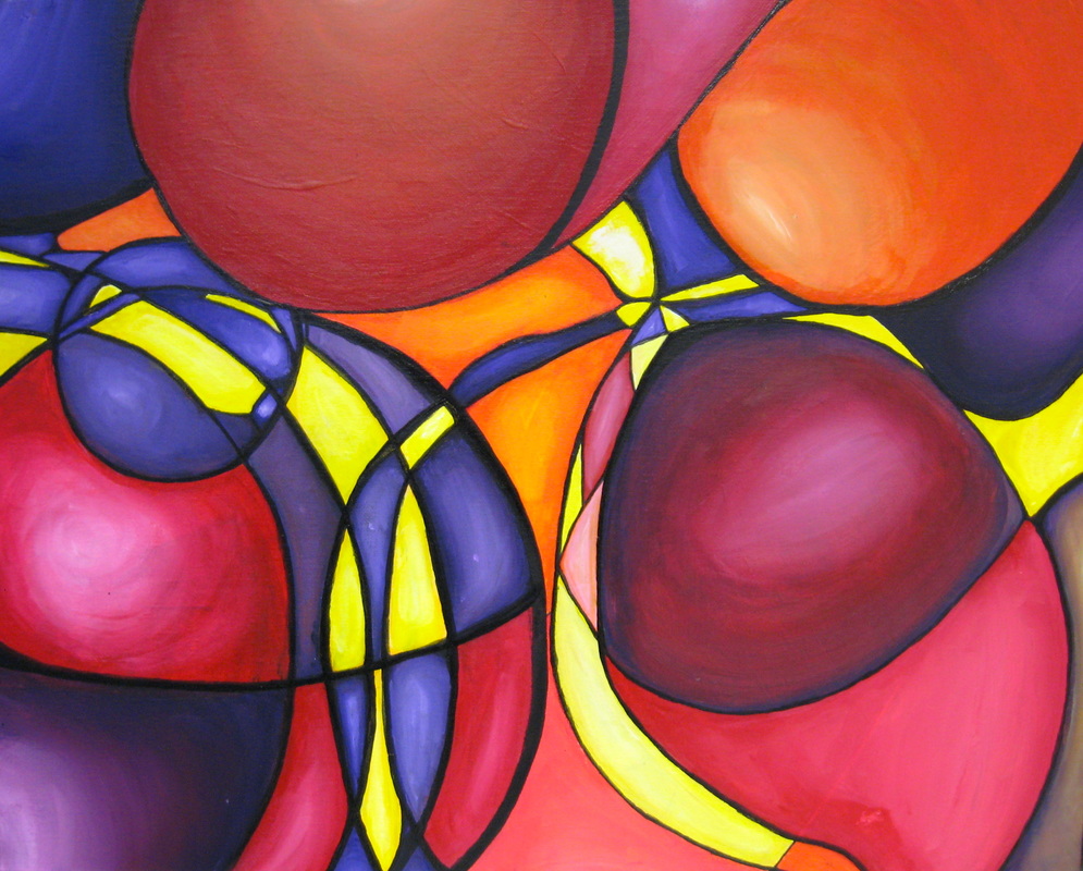
December 2014
|
12" X 12"
acrylic It is not an original picture but meant for practicing blending colors with acrylic paint. Sold. |

|
|

Wax resist, December 2014
|
13" X 9"
wax resist This is not an original image; I found this figure in a book. I have always enjoyed techniques, such as this, where you remove the dark rather than add it. I love how easily simple things can be turned into art. |

Gears, December 2014
|
12" X 12"
prisma colored pencil |

Lighthouse, January 2015
|
24" X 18"
text, watercolor, acrylic, & charcoal. TEXT ME For this project we picked an alphabet letter randomly, then had to pick the subject based on the letter. And we needed to use either text or map, somewhere in the piece. I picked L. There are two places in the world that I have always wanted to go to, Venice and Ireland. And I had already done Venice in My cardboard project. I started by researching landscape, or trying to figure out what is there that could work with L. Lighthouse soon became the obvious subject. This lighthouse, though inspired by, is not a light house that is actually in Ireland. |

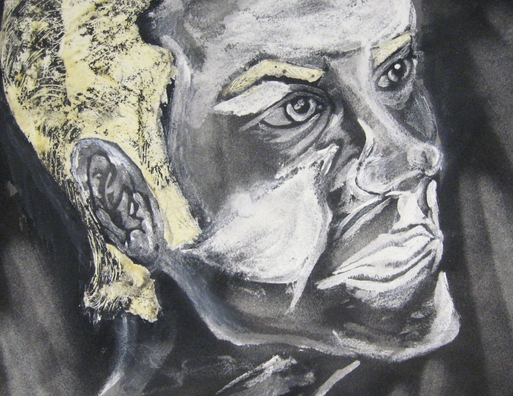
Anger, January 2015
|
20" X 16"
multimedia This piece was designed as a figure in an environment. I am very intrigued by facial expressions, so when I found this one, I knew that I wanted to work with it. With the facial expression, the environment was somewhat obvious- anger. When you are angry you cannot think about anything else, so anything besides a chaotic background wouldn't make any sense. |
Jelly bean, March 2015
|
16" X 20"
acrylic and ink |

Owl, June 2015
|
20" X 16"
charcoal and watercolor |

shrimp cocktail, May 2015
|